Advance confidently in the direction of your dreams.

Growing a business single-handed, a collection of articles and hopefully inspiration.

Monday, October 14, 2013

Pattern for Reading Web Content

F-Shaped Pattern For Reading Web Content

by Jakob Nielsen on April 17, 2006
Summary: Eyetracking visualizations show that users often read Web pages in an F-shaped pattern: two horizontal stripes followed by a vertical stripe.
F for fast. That's how users read your precious content. In a few seconds, their eyes move at amazing speeds across your website’s words in a pattern that's very different from what you learned in school.
In our new eyetracking study, we recorded how 232 users looked at thousands of Web pages. We found that users' main reading behavior was fairly consistent across many different sites and tasks. This dominant reading pattern looks somewhat like an F and has the following three components:
  • Users first read in a horizontal movement, usually across the upper part of the content area. This initial element forms the F's top bar.
  • Next, users move down the page a bit and then read across in a second horizontal movement that typically covers a shorter area than the previous movement. This additional element forms the F's lower bar.
  • Finally, users scan the content's left side in a vertical movement. Sometimes this is a fairly slow and systematic scan that appears as a solid stripe on an eyetracking heatmap. Other times users move faster, creating a spottier heatmap. This last element forms the F's stem.
Obviously, users' scan patterns are not always comprised of exactly three parts. Sometimes users will read across a third part of the content, making the pattern look more like an E than an F. Other times they'll only read across once, making the pattern look like an inverted L (with the crossbar at the top). Generally, however, reading patterns roughly resemble an F, though the distance between the top and lower bar varies.
Eyetracking heatmaps with 3 different examples of the F-pattern for reading web pages
Heatmaps from user eyetracking studies of three websites. The areas where users looked the most are colored red; the yellow areas indicate fewer views, followed by the least-viewed blue areas. Gray areas didn't attract any fixations.
The above heatmaps show how users read three different types of Web pages:
  • an article in the "about us" section of a corporate website (far left),
  • a product page on an e-commerce site (center), and
  • a search engine results page (SERP; far right).
If you squint and focus on the red (most-viewed) areas, all three heatmaps show the expected F pattern. Of course, there are some differences. The F viewing pattern is a rough, general shape rather than a uniform, pixel-perfect behavior.
On the e-commerce page (middle example), the second crossbar of the F is lower than usual because of the intervening product image. Users also allocated significant fixation time to a box in the upper right part of the page where the price and "add to cart" button are found.
On the SERP (right example), the second crossbar of the F is longer than the top crossbar, mainly because the second headline is longer than the first. In this case, both headlines proved equally interesting to users, though users typically read less of the second area they view on a page.

Implications of the F Pattern

The F pattern's implications for Web design are clear and show the importance of following the guidelines for writing for the Web instead of repurposing print content:
  • Users won't read your text thoroughly in a word-by-word manner. Exhaustive reading is rare, especially when prospective customers are conducting their initial research to compile a shortlist of vendors. Yes, some people will read more, but most won't.
  • The first two paragraphs must state the most important information. There's some hope that users will actually read this material, though they'll probably read more of the first paragraph than the second.
  • Start subheads, paragraphs, and bullet points with information-carrying words that users will notice when scanning down the left side of your content in the final stem of their F-behavior. They'll read the third word on a line much less often than the first two words.

Detailed Scanning Behaviors

It's fascinating to watch the slow-motion replay of users' eye movements as they read and scan across a page. Every page has reading issues beyond the dominant F pattern I'm discussing here. For example, users scan in a different, more directed way when they're looking for prices or other numbers, and an interesting hot-potato behavior determines how users look at a list of search engine ads. We also have many findings on how people look at website images.
The biggest determinant for content usability is how users read online — and because people read differently, you have to write differently.

Writing Blog Content – Make it Scannable

Filed Under: 31 Days to Building a Better Blog, Writing Content

Only 16% of people read web sites word for word. Source
The average person only comprehends 60% of what they read. Source
Knowing this – how should bloggers who want to communicate effectively write?

Is your Blog Scannable ?

Most people read online by scanning the page for individual words or phrases, headings and other visual cues. Studies have shown that reading from a screen is more tiring and therefore about 25% slower than reading from paper – hence scanning becomes a technique that most employ.
Is your Blog Scannable? It’s a pretty simple thing to test. Ask a friend who is not familiar with your site to take a quick look at a few of your recent posts. Give them 15 to 30 seconds on each post, at the end of which you ask them what the post was about. You’ll quickly get a sense of how they’ve interacted with your blog.

Techniques to Make your Blog Scannable

Good bloggers keep this in mind as they write and will employ a variety of techniques to make their posts easier to read. Some of these techniques include:
  • Lists – Anecdotal evidence here at ProBlogger suggests that its my posts with bullet point lists in them that get linked to ALOT more than similar length posts written in of an essay style.
  • Formatting – Use bold, CAPITALS, italics, underlining, teletext and to emphasize points. Don’t go overboard as you run the risk of frustrating your reader. Also consider changing font size, color and style to draw your readers eyes to your main points.
  • Headings and Sub Headings – Large, Bold words that act as visual cues of what is happening in the content are effective ways of drawing readers further into articles.
  • Pictures – Research shows that readers eyes are drawn down the page by pictures. Place them cleverly by your key points (especially when they closely relate to the content) and you have more of a chance of getting readers to read full articles.
  • Borders/Blockquotes – boxes around quotes and key points can similarly get the attention of readers.
  • Space – don’t feel you have to fill up every inch of your screen – rather create spaces because they help readers not to feel overwhelmed and again tend to draw readers eyes to what is inside such space.
  • Get to the Point – try to be succinct with your points.
  • Don’t Bury your Points – one trap many of us fall into is to bury our main points deep within content where it’s unlikely to be noticed. If you have a key point make sure you say it up front. You can expand upon it later but get your message across in the first few sentences if possible.
  • Find creative ways to reinforce your main point throughout your post.
  • Don’t Introduce too many New Ideas in one post – once again this helps to avoid overwhelming readers with information all at once. If you want to cover many ideas that relate to one another consider a series of posts that link to each other.
If your site and its posts are not easily scannable you run the risk of losing your reader to another blog that is.

How to write a great blog post

It hits you like a TON of BRICKS! It’s an idea for that KILLER blog post that is just bound to bring you all the traffic that you’ve ever dreamed of.
With the idea fresh in your mind you sit down at your keyboard and BANG it out – desperate to hit publish as quickly as you can for fear that someone else will beat you to the PUNCH!
PublishImage by pallotron
As SMOKE rises from your keyboard you complete your post, quickly add a title to it and proudly hit PUBLISH!
Visions of an avalanche of visitors, incoming links and comments swirl before you.
But then…
Reality hits you like a SLAP in the face. There are few visitors, no comments and no links. It’s not a KILLER post – it’s DEAD.

Ever had that experience?

I have – many many times over.
Today I want to start a series of posts that will walk you through an alternative workflow for constructing a blog post – one that takes…. time.
How-To-Craft-A-Blog-Post
Image by Samyra.S
If there’s one lesson that I’ve learnt about writing for the web it’s that a key element to writing successful blog posts is that in most cases they take time to CREATE.
I emphasize ‘create’ because I think too often as bloggers we ‘PUNCH’ out content as though we’re in a race or under some kind of deadline. It’s almost like we’re on a production line at times – unfortunately the posts we write often reflect this.
In this series I want to suggest an alternative approach – the crafting (or creation) of content.
This process is a more thoughtful process that is about crafting words and ideas – shaping posts into content that take readers on a journey.
To kick off this series I want to suggest 10 points to pause at when writing a post on your blog. I’ll include a link to each post that follows in this series as I update them.
Instead of rushing through a post – I find that if I pause at these key moments my post rises to a new level of quality and posts tend to get more traction with readers. They don’t guarantee the perfect post – but they certainly take you a step closer to a good one.
  1. Choosing a Topic – take a little extra time defining your topic and the post will flow better and you’ll develop something that matters to readers.
  2. Crafting Your Post’s Title – perhaps the most crucial part of actually getting readers to start reading your post when they see it in an RSS reader or search engine results page.
  3. The Opening Line – first impressions matter. Once you’ve got someone past your post’s title your opening line draws them deeper into your post.
  4. Your ‘point/s’ (making your posts matter) - a post needs to have a point. If it’s just an intriguing title and opening you’ll get people to read – but if the post doesn’t ‘matter’ to them it’ll never get traction.
  5. Call to Action – driving readers to do something cements a post in their mind and helps them to apply it and helps you to make a deeper connection with them.
  6. Adding Depth – before publishing your post – ask yourself how you could add depth to it and make it even more useful and memorable to readers?
  7. Quality Control and Polishing of Posts – small mistakes can be barriers to engagement for some readers. Spending time fixing errors and making a post ‘look’ good can take it to the next level.
  8. Timing of Publishing Your Post – timing can be everything – strategic timing of posts can ensure the right people see it at the right time.
  9. Post Promotion – having hit publish – don’t just leave it to chance that your post will be read by people. Giving it a few strategic ‘nudges’ can increase the exposure it gets exponentially.
  10. Conversation – often the real action happens once your post is published and being interacted with by readers and other bloggers. Taking time to dialogue can be very fruitful.
Taking extra time at each of these 10 points looks different for me in every post that I do – but I believe that every extra moment spent of these tasks pays off.
Some times the pause I take in one step will be momentary while in others it could take hours or even days to get it just right. Sometimes the above process happens quite automatically and other times I need to force myself to stop and ponder something like a title or the timing of a post.
Each of the 10 points above have much more that could be said about them so over the weeks I’ll be tackling each in turn in the hope that we can have some good discussion and sharing of ideas around them. I’ll link to each of them from within the list above as I release the posts.
For each point I hope to give some insight into how I tackle them and will share a few practical tips and examples of what I’ve done that has worked (and not worked). Don’t expect posts each day on this series – like all good things – this will take us some time!

Sunday, October 13, 2013

Writing great Internet Ads from Google

Step 5: Write great ads

When writing your ads, start by taking a moment to consider what you want to say about your business. Then use the six guidelines in this article to create an ad that's accurate, to the point, and engaging – and hopefully brings you lots of clicks!
Highlight what makes your business, product, or offer unique
Do you offer free delivery? A large selection? Tell people! Highlight features or areas that make your business stand out from the competition.
Include prices, promotions and special offers
If you have something special to offer, make sure that your customers see it. This is likely to appeal to potential customers and could increase the likelihood of those users visiting your website.
Tell your customers what they can do
Are you selling? Tell them that they can buy. Strong verbs like "Purchase," "Call today," "Order," "Browse," "Sign up" or "Get a quote" tell your customers what they can expect to do when they arrive at your website.
Include at least one of your keywords in your ad text
This can catch the attention of the people who searched for the keywords, and show that your ad is related to what they want. Additionally, the keyword that you use will appear in bold in your ad, just like it does in the search results, making it more obvious how relevant your ad is.
Match your ad to your landing page
Your homepage might not always be the most relevant page for all visitors. Take a look at the page on your website that you're linking to, which is called the landing page. Make sure that you link your ad to the page that is most relevant to what you are advertising. If visitors don't find what they expect to see when they reach your site, they might leave.
Experiment
Create three to four ads per ad group, trying out different messages to see which performs the best with your customers. AdWords can automatically show the better-performing ads within an ad group more often. This removes the guesswork and lets you build on what you've learned from your experiments.

Wednesday, October 2, 2013

Google's New Secure Search Means More Work for Online Business Owners

This week, Google started encrypting all organic searches on the site. This means that business owners who track keyword data provided by Google on search traffic are now out of luck as keywords won't be supplied for these secure searches.
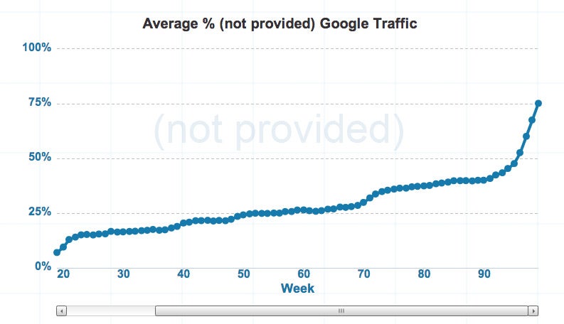
In 2011, Google started masking keyword data and labeling it as "(not provided)" for anyone that was logged into their Google account. Also known as secure search, Google mentioned that this was done in an effort to protect personalized results that it delivers. Google noted that this change would initially impact single-digit percentages for all Google searches. Today, that number stands close to 75 percent of websites tracked by Not Provided Count (see graphic below).
Google's New Secure Search Means More Work for Online Business Owners
For business owners who develop web content based in part on the keywords Google says people search for when they land on their website, here are some important notes to keep in mind:
You can still get keyword data if you buy ads.
Interestingly, Google will pass you keyword data if you're running ads on Google. This might raise the question of whether Google is trying to generate more revenue by hiding organic keyword data.
Related: Google Looking Beyond 'Cookies' to Track People Online
You can still get keyword data from Google Webmaster Tools.
You're able to see the top 2,000 queries per day going back to 90 days through Google Webmaster Tools. Google has indicated that this will increase in the future to one year. You'll have to continue to archive these on a consistent basis or else you'll lose all the data. With AdWords, however, you can save this data for as long you like.
It's time to start adopting other methods to develop content ideas.
It used to be that you could look at keyword data in Analytics to generate content ideas but since that is now going to be stripped away, it's time to look at other methods for keyword and content research. Ubersuggest is a strong tool for providing content recommendations. Another one is analyzing your internal search data.
Start focusing more on conversion rate optimization.
Keyword data disappearing isn't such a bad thing in this case, as the loss of it will cause online business owners to focus more on the right things, individual landing pages, instead of individual entry keywords for each landing page. This is a more optimal way to be optimizing your conversion rate because you are focusing on increasing the conversion rate of the page instead of looking at lesser details.

ShareThis